PROJECT: Administrative Systems Consolidation

Survey, card sorting, information architecture, and usability testing to create new centralized destination for information about related systems and services.
Business Problem
More than a dozen related administrative systems and services within the central IT department exhibited no consistency.
-
No centralized access point/inventory/"key"
-
Duplication/overlap of information—no way to know which is correct/authoritative
-
No common depth or type of content
-
No common look/feel/branding
-
Limited user traffic, high support call volume
-
Multiple versions of help desks, access request forms, project/enhancement request processes, project methodologies, communication techniques/frequencies/standards
Project Goals
-
Combine, consolidate, and streamline information and access points in a way that makes sense to our customers so that they can accomplish what they need to
-
Eliminate confusion about who does what, and who can provide assistance
-
Standardize type and depth of information
-
Use consistent branding
Challenges
-
Massive amounts of content with multiple owners and thousands of users
-
Political considerations/"territory"
-
Potentially difficult to obtain representative sample of such a diverse set of users for input
Research Goals
-
Discover which systems and related content are most used, and how often, on average, by typical users
-
Learn what information users find most helpful, and their preferred ways of finding/consuming it
-
Determine what information is missing
Research Approach
Convene a committee with representatives from:
a) all major units that provide content, and
b) a selection of areas that consume content
to work together and act as user panelists and liaisons both within and across areas.
Primary Questions
-
How do core users currently approach the task of finding information?
-
What information is the most important to them?
-
What is working well?
-
What information or functionality is missing?
-
What structure makes the most sense?
Methods
-
survey
-
card sorting
-
information architecture
-
usability testing
Results
Surveys, card sorting, and interviews revealed common themes around the requirements for a central access point for systems, services, and supporting information.
I based the information architecture and prototype on the following research findings:
-
More than 40% of participants coalesced around system/departmental/functional categories, with an overview and items such as Security/Access, Training, Help, System Login, News, etc., within each section.
-
There were also several similar variations on the idea of an “Overarching Systems Homepage” with “System-specific Landing Pages,” as well as a single category for information pertinent to all systems (NU Systems: Overview, Access, Forms, Training, & Help).
-
Multiple new user/getting started/onboarding categories combined items related to system/process overviews, org charts, login, security access, training, and help.
-
Items involving policy, procedures, and processes were often placed in their own categories, but also made appearances in both the new user and functional groupings.
-
Key new content requests included system overviews, onboarding resources, and personalization capabilities.
Usability testing helped us confirm the structure and refine the details of language and content elements in each section.
SELECTED ARTIFACTS

An online card sorting tool helped organize results for easier analysis

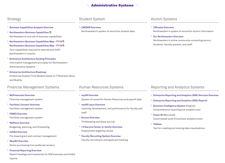
Architecture diagram showing how system-related content would be organized
The consolidated home page for system-related content

Example of a single system home page