PROJECT: NUsites
Summative usability evaluation of updates to University’s free self-publishing platform for students, faculty, and staff to build academic and research-related sites and blogs
Business Problem
-
Current users frequently don't take advantage of the platform's full capabilities
-
Current users often do not follow required branding standards
-
Current users rely on telephone/email support from one individual with other obligations
-
Potential users often use outside consulting and commercial platforms and produce sites that are not properly branded
Project Goals
-
Facilitate users’ ability to follow the University brand standards with templates
-
Increase ease-of-use for novice users and encourage experienced users to take advantage of additional features
-
Attract new users with updated design, increased usability, and enhanced marketing
-
Reduce strain on existing support staff by providing new documentation available from within the tool
Challenges
-
Decisions to this point had relied on the developer and support person's opinions, not on user research
-
Management saw usability testing as a way to confirm, not challenge, these assumptions
-
Timelines had been delayed for technical reasons prior to usability testing, and launch was imminent
Research Goals
-
Discover current and potential users' familiarity and comfort with blogging, content management, and web design platforms in general
-
Evaluate ease-of-use and appeal of new introductory page and templates
-
Ascertain users' likelihood of seeking out support documentation
-
Probe sentiment around general topic (web design) and specific solution (CampusPress and branded templates)
Research Approach
Primary Questions
-
Are typical NUsites users comfortable with web-based site/content tools in general?
-
Will users consult support/training documentation? Under what circumstances?
-
Will providing fill-in templates make it easier to follow brand standards?
-
What is overall impression of the redesign?
Methods
I worked with eight current and potential users with a mix of platform-related experience and comfort levels.
-
User interviews
-
Usability testing (introductory web page and sample template)
Results
Overall, testers did not want to read introductory text or support documentation, and found platform-specific terminology confusing.
-
Text Quantity: Most testers were drawn to icons, but wouldn't read the text associated with them if it was more than a phrase/heading's worth.
Recommendation: Significantly reduce, bullet, and/or eliminate text under the bold step-by-step headings.
-
Visual Design: Large hero images impeded some users' scrolling.
Recommendation: Reduce size of hero image so that content lower on the page is visible; include small arrow icon overlay to prompt scrolling.
-
Naming/Access: All testers resisted using available documentation even when they were stuck.
Recommendation: Consider referring to documentation as “Help,” “How-to’s,” or “Resources” and remove any references to “documentation” or “instructions.”
Recommendation: Where possible, include tooltips, icons, overlays, and/or very brief inline explanatory text within the application rather than forcing people to click away for help.
-
Vocabulary: Most testers struggled with platform terminology.
Recommendation: Consider including alternative names, a key, or a glossary for unfamiliar terms, such as hero, divi, and lockup.
Recommendation: Provide inline and/or obvious cues for novices; let them know they won’t “break” anything while they gain experience.
Examples:
- tooltips
- confirmations/dialogues
- preview function
- sandbox
- Context: Testers had difficulty distinguishing site-level settings via the customizer and content administration via the dashboard. They often tried to do one type of edit in the other area.
Recommendation: Add note to the customizer to let users know that it is exclusively for site-level settings and that content changes should be handled from the dashboard.
- Add note that the customizer must be closed to return to content editing.
Recommendation: Look into a way to better differentiate which function they are currently using (background shading? Font color? Highlighting?).
Recommendation: Consider hiding admin bar customizer preview and possibly removing customizer link from top admin bar, forcing users to navigate there through appearance, to help understand context better.
Recommendation: Consider very brief, forced introductory overlay for first-time users to point out the features on the screen and/or distinguish the two possible types of administration (site vs. content).
SELECTED ARTIFACTS

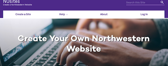
Banner and image on NUSites home page

One-page overview of usability testing and interview planning

Recommended changes to informational page based on usability test and interview results

Visual representation of usability testing results (supplement to written report)